Design Pieces

Created while working at Herbert Perman Design
Iconography created for the Shopping guide of a traditional food retail client, KarneKeijo. The icons ilustrate the different categories of food (meat, cheese, pork, etc). The visual style made the content more contemporary and facilitated the comprehension of the guide.

Created while working at Herbert Perman Design
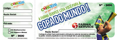
This material was created for Farma Service to use in a pharmaceutical convention in Rio de Janeiro. The theme of the world cup was chosen due to the fact that they were giving away one trip to the 2006 World Cup in Germany, as well as Brazilian soccer jerseys as gifts to their clients. all of their visual communication for the following this theme. The visual was a mix of modern design along with retail elements.
Created while working at Herbert Perman Design
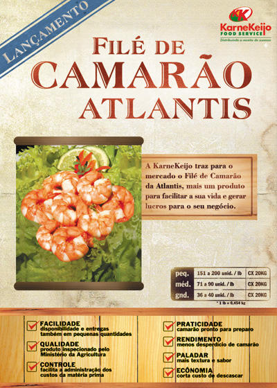
Pamphlet created for KarneKeijo for the release of Atlantis' Shrimp products. The target audience was the owners of restaurants and bars.


Created while working at Plano B) Advertising
This presentation folder was created for the regional branch of the Coca-Cola Company. They wanted to put more of their refrigerators in more
Created while working at Plano B) Advertising
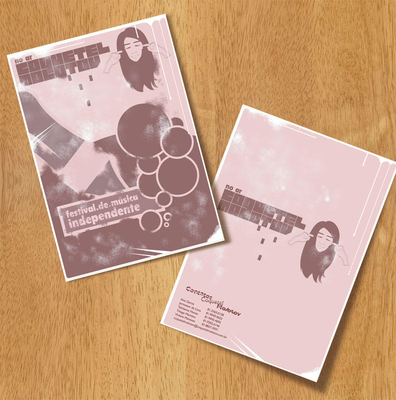
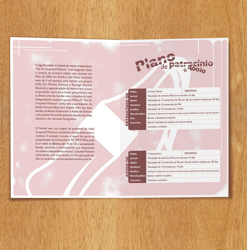
This was the cover of a presentation folder for a alternative music festival called Coquetel Molotov. The name means home made bomb, and the festival had only underground pop bands playing, so, I took both of those things into consideration when designing this piece. Many stereotypical elements of the pop world were used, but with a vintage approach to them. The presentation folder was printed out in newsprint, and put inside a beer bottle with a rag coming out of the top, therefore, resembling a home made bomb.


Ghost work | Not produced
These three were direct mail pieces that I created for a class project while in college. They feature the then-recently released Mazda RX-8. The three cards each played on a different strength of the car. The edgy layout appealed to the audience of 20+ adults.

Created while working at Plano B) Advertising
This was a stationary and business card designed for Microhits. I wanted to incorporate more elements and keep the layout of the pieces consistent. Thus, I used a very light texture in the background to create that unity throughout them.
posted by Mike Albuquerque @ 8:27 PM
![]()

0 Comments:
Post a Comment
<< Home