Posters
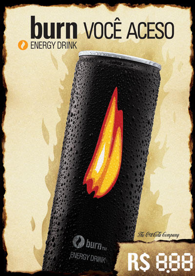 Created while at Plano B) Advertising
This poster was created for Refrescos Guararapes, the regional branch of The Coca-Cola Company. It was placed in POS all over the state in order to bring further awareness to Burn, Coke's energy drink that was trying to earn its place in market where Red Bull and Flying Horse dominated. By using the burned paper edges as an element, the design made a visual play with the product's name, and appealed to the target audience of young adults.

This poster was designed for R2. Its purpose was to let people know about R2's big 1yr party. I used a style that was somewhat similar to the one of the posters previously done in the gym, but that still had a nightlife appeal.

This was a poster also designed for R2, the biggest gym in my state. They started a program to have events out of the gym and this was the first poster for that. This poster advertised their beach volley tournament, and used the colors that reflected the current season, summer, and featured a straight forward layout.

This was the design for a backlit poster. This poster was made to set the mood of a computer store called Microhits. They wanted to appeal to a teen audience, therefore, I used many graphic elements to which that audience could relate to creating a contemporary and high tech look

This was a poster that I created for an Easter play. The play was called the Sacrifice, and I wanted to portray the graphic side of what was to be seen. The minimalistic design called attention and was very well received by the theatre group.

This was a poster I did for a electonic music party organized by a Capoeira group. The layout was intended to portray a modern look, as desired by the organizers of the party. I used blue and yellow since those were the official colors of the group.
Design Pieces
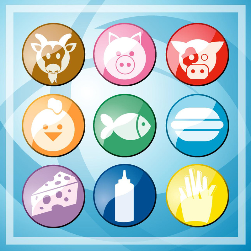
 Created while working at Herbert Perman Design
Iconography created for the Shopping guide of a traditional food retail client, KarneKeijo. The icons ilustrate the different categories of food (meat, cheese, pork, etc). The visual style made the content more contemporary and facilitated the comprehension of the guide.

 Created while working at Herbert Perman Design
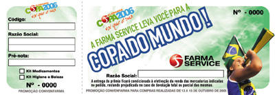
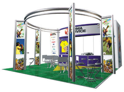
This material was created for Farma Service to use in a pharmaceutical convention in Rio de Janeiro. The theme of the world cup was chosen due to the fact that they were giving away one trip to the 2006 World Cup in Germany, as well as Brazilian soccer jerseys as gifts to their clients. all of their visual communication for the following this theme. The visual was a mix of modern design along with retail elements.
 Created while working at Herbert Perman Design
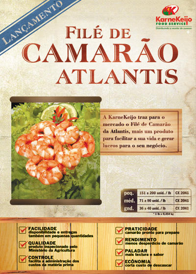
Pamphlet created for KarneKeijo for the release of Atlantis' Shrimp products. The target audience was the owners of restaurants and bars.

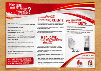 Created while working at Plano B) Advertising
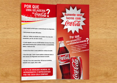
This presentation folder was created for the regional branch of the Coca-Cola Company. They wanted to put more of their refrigerators in more

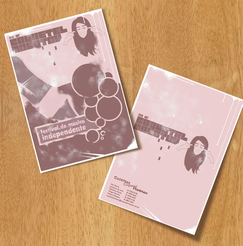
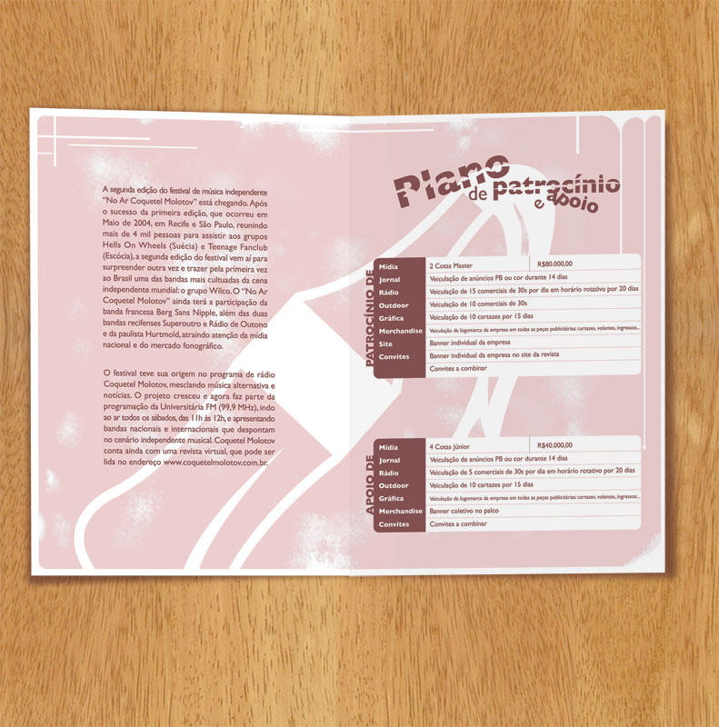
 Created while working at Plano B) Advertising
This was the cover of a presentation folder for a alternative music festival called Coquetel Molotov. The name means home made bomb, and the festival had only underground pop bands playing, so, I took both of those things into consideration when designing this piece. Many stereotypical elements of the pop world were used, but with a vintage approach to them. The presentation folder was printed out in newsprint, and put inside a beer bottle with a rag coming out of the top, therefore, resembling a home made bomb.


 Ghost work
 | Not produced
These three were direct mail pieces that I created for a class project while in college. They feature the then-recently released Mazda RX-8. The three cards each played on a different strength of the car. The edgy layout appealed to the audience of 20+ adults.
 Created while working at Plano B) Advertising
This was a stationary and business card designed for Microhits. I wanted to incorporate more elements and keep the layout of the pieces consistent. Thus, I used a very light texture in the background to create that unity throughout them.
Packaging Design
 Created while working at Herbert Perman Design
 | Work in Progress
These are the latest versions of a project I have been developing. The client is releasing a quality product into the national market of Cashew Nuts. He wanted his product to stand out amongst the competition, therefore, the idea of using a box instead of a can. The box also allowed us to have a window so the consumer could see the cashews before buying them, something our client demanded. The shape of the box is peculiar and accentuated by the design. We worked with 3 colors to differentiate the flavor of the products (Roasted and Salted, Chocolate, and Caramel).
 Created while working at Herbert Perman Design
 | Work in Progress
This project is for a new company that´s releasing a new premium beer in the Northeastern states of Brazil. The name Dez, means Ten, and is also slang for something that´s good, great. 3 different versions of the design were created to present to the client. The elements used were all carefully thought out in order to enforce the concept of this being a premium product.

 Created while working at Herbert Perman Design
 | Work in Progress
Packaging created for supermarket Gonzaguinha's brand noodles. The visual extended through their whole line of noodles, and a character was created to act as the brand's mascot.

 Created while working at Herbert Perman Design
 | Work in Progress
Brazilian brand Bom Leite wanted to redesign their yogurt packaging, updating it, and making it more competitive in both local and national markets. For such, I added elements that made it more appealing visually like the large strawberries, and the spoon, to suggest a call to action.

Cristalina was a traditional brand in the north of Brazil, but had currently started being forgotten due to the increasing number of competitor's entering the market, including Coke's own brand of water. So, we redesigned their bottle, as well as the label. We kept the traditional illustration that had been present in the water's label for the last 20 years, but cleaned it up and updated it.
Ads

Translation:
Forget the wagon. (This was an ad for St. John's, a Brazilian national holiday in which people dress up as rednecks. One of the traditions is square dancing, in which typically, there's a wedding in which the bride comes in a wagon). (RCR is a bus rental company that wants to encourage travel companies to rent their buses during holidays.)
This ad was created having St. John's holiday in mind. The whole visual style of the ad is reminiscent of this party's style and feel. The blue background was added due to the fact that blue is the main color of RCR.


Translation:
Fuji, recording memorable moments, and some not so memorable.
These were ads created for another college project. They were meant to have a humorous tone that could lead this campaign into being one that'd be widespread on a variety of different mediums. The photography in these pieces has a peculiar contrast and color, and an exageration of poses so that it'll emphasize the situation.

Translation:
Today you can celebrate in the town's beaches, in the town's parks, in the town's squares, or if you rather, in the town's mall. Shopping Boa Vista. Our town's mall.
This ad was created for the 468th anniversary of the foundation of Recife, and the 470th anniversary of the foundation of Olinda. Both Recife and Olinda are historic cities with a culture and history that are very connected to the past. This ad was an homage of the Boa Vista mall, a mall that is strategically positioned to serve people from both cities. It is also positioned in the historic district of Recife. The layout chosen was meant to emphasize this all.


Translation:
They're already waiting for Body Center to open.
Body Center was a fictional 24-hour gym. This was a the fictional client for which I had to create a series of ads in the competition to try to get an internship in Ampla, the biggest ad agency in the Northeast.

CTG is an Adobe certified training center. They wanted us to create an ad for them that not only portrayed advanced use of the Adobe tools, but also that would let viewers know that they now had extended hours. The solution to that was creating a package design of a energy drink which was similar to a well-known one. The headline read:
CTG courses. Now with longer hours. And of course, more content.


Translation:
Is your limit a problem?
This witty campaign was created to be a fun way to play around the idea that with Visa you don't have to have limits, at least credit-wise.
Internal Marketing

Poster

Coaster

Bathroom mirror sticker
This was a campaign to let the workers of TIM (a local cellphone carrier) know that R2 (the biggest gym in town) was offering them a discount. To do that, we created pieces that would be both visible in the workers' daily routines and that could be useful to them. The one that stands out the most is the bathroom sticker, which reads "You work out ar R2 with discount rates, and here you check out the results.
Logos
 Created while working at Herbert Perman Design
This logo was the beginning of a fresh new direction for the Natto brand. A brand that had established itself in the Northeastern region of Brazil by selling chicken meat, and was now looking to expand to other areas, selling dairy based products and potentially more areas in the future. Their old logo had a chicken in it, so I tried to stay away from that image, as it would maintain the association that they only sold those products. Yellow and red were chosen as colors due to the fact that those were amongst the colors used in the old logo. The result was a visually strong brand that matched well Natto's new direction and was more flexible in their packages.

This logo was created to be simple, and to obviously reflect the fact that Microhits is a computer store. For that, I altered a font making it rounder and thicker and incorporated a typical element from the computer world into the letter "o".

The logo above was created for a fast-food restaurant which was inside of a country club. The name paddock, which is the place where horses stay before a competition, was decided by the owner, who also wanted to make that the theme of the logo. The visual was made using colors that would stand out in the club's landscape.

Created for a youth group, this logo was meant to reflect the point that the group seeks to attract people to them. It does so through the graphic element which portrays that idea. The color choice shows that it's a young group.
 Created while at Herbert Perman Design
Gonzaguinha is the brand of products from the Supermarket Rio do Peixe. They were looking to create a brand with a familiar element to the Northeast of Brazil. So we picked the Sun as that symbol, and used a typography that was consistent with the look and feel we were going for. The result is a simple logo that is easily associated by the target audience.
 Created while at Plano B) Advertising
 | Not Approved
Nordeste is a company that sells electronic devices to big companies. They wanted to have a mascot that had a regional appeal, incorporated into the logo. I used the "cangaçeiro" hat which is a strong regional element, and made the typography consistent with the visual of the mascot.

This was the logo created for a cd club. Cd Clube is a cd rental service where members get to rent genre cds (which aren't easily found in Brazil). The group is specifically targeted for teens and young adults, therefore, I decided to go with a modern approach with organic lines breaking out of the logo.