Posters
Created while at Plano B) Advertising
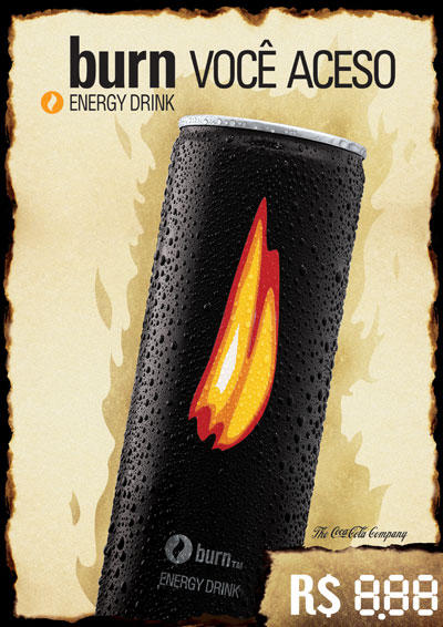
This poster was created for Refrescos Guararapes, the regional branch of The Coca-Cola Company. It was placed in POS all over the state in order to bring further awareness to Burn, Coke's energy drink that was trying to earn its place in market where Red Bull and Flying Horse dominated. By using the burned paper edges as an element, the design made a visual play with the product's name, and appealed to the target audience of young adults.

This poster was designed for R2. Its purpose was to let people know about R2's big 1yr party. I used a style that was somewhat similar to the one of the posters previously done in the gym, but that still had a nightlife appeal.

This was a poster also designed for R2, the biggest gym in my state. They started a program to have events out of the gym and this was the first poster for that. This poster advertised their beach volley tournament, and used the colors that reflected the current season, summer, and featured a straight forward layout.

This was the design for a backlit poster. This poster was made to set the mood of a computer store called Microhits. They wanted to appeal to a teen audience, therefore, I used many graphic elements to which that audience could relate to creating a contemporary and high tech look

This was a poster that I created for an Easter play. The play was called the Sacrifice, and I wanted to portray the graphic side of what was to be seen. The minimalistic design called attention and was very well received by the theatre group.

This was a poster I did for a electonic music party organized by a Capoeira group. The layout was intended to portray a modern look, as desired by the organizers of the party. I used blue and yellow since those were the official colors of the group.
posted by Mike Albuquerque @ 1:09 AM
![]()

0 Comments:
Post a Comment
<< Home